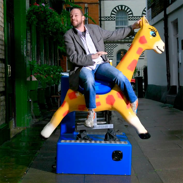
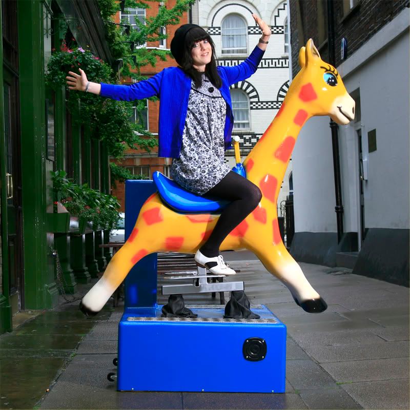
Lee Fasciani (Senior Designer, Fold 7)
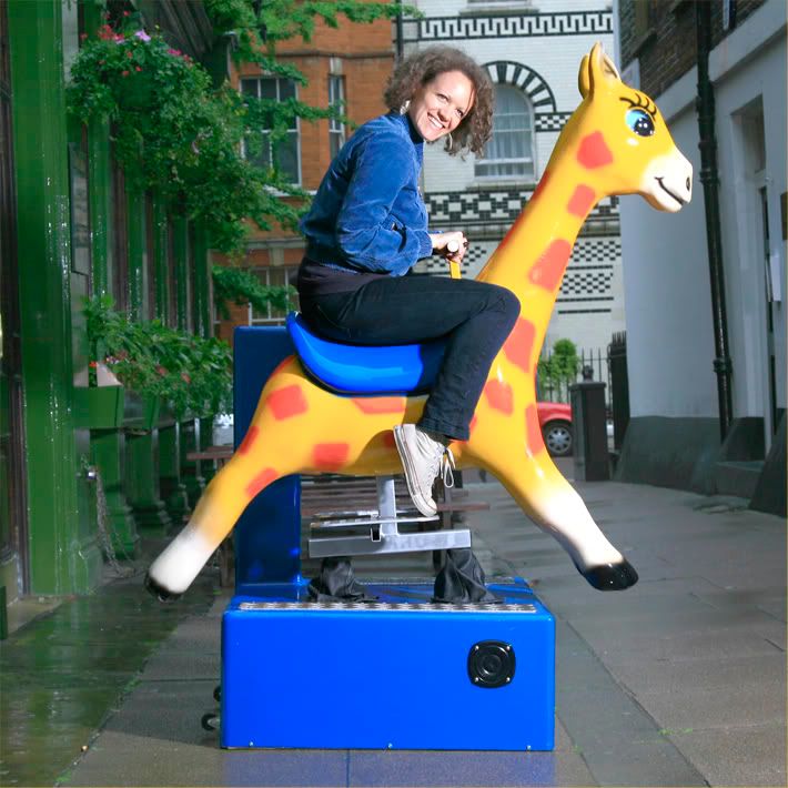
Suzie Hydon (Designer, Fold 7)
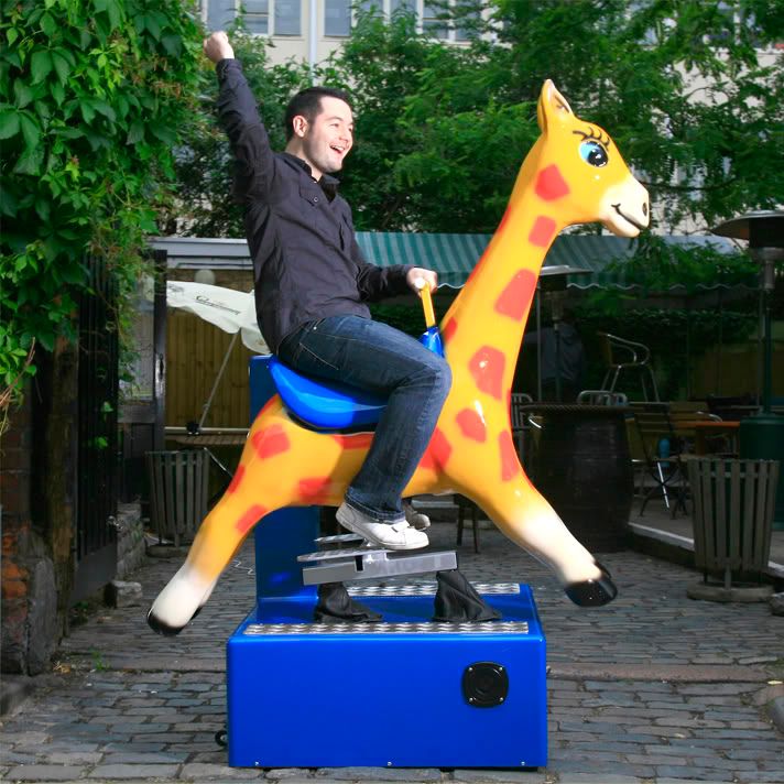
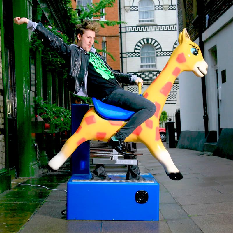
Robert Urquhart (Editor, Designers Are Wankers)
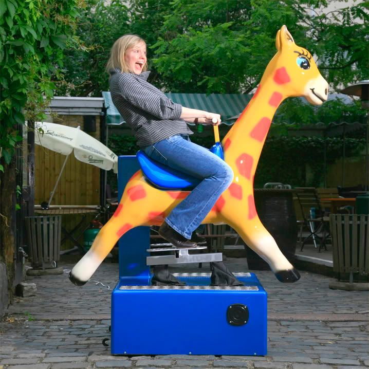
Angharad Lewis (Deputy Editor, Grafik Magazine)
Laura Clayton (Staff Writer, Grafik Magazine)
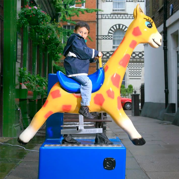
Henry Holland (Creator / Designer, House Of Holland & Fashion Editor, Bliss Magazine)
A little kid who couldn't resist
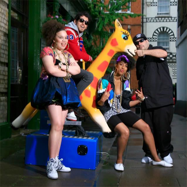
Zezi (Editor, Super Super), Kesh (Fashion Editor, Super Super), & Chromeo (Canadian pop sensations)


2 comments:
hI aNNA
Yeah I agree on that photo looking really vibrant and I guess its cos she is wearing blue as well which brings out the other blue in the pic. you have prob already done so but you could try altering the saturartion to enhance colour and also there is the curves (apple m is the shortcut) and then you can adjust the level of lights and darks in the iamge by placing 3 points down the diagonal line and pulling into an 's' shape. sorry if you already know all this! I think as natural as possible is the way to go as sometimes too many adjustments look wierd in print.
hope that helps
Aimeex
Hi anna, I wouldn't worry too much about technical stuff as it is something personal...
I like them all as they are! fun!!
cristina
Post a Comment